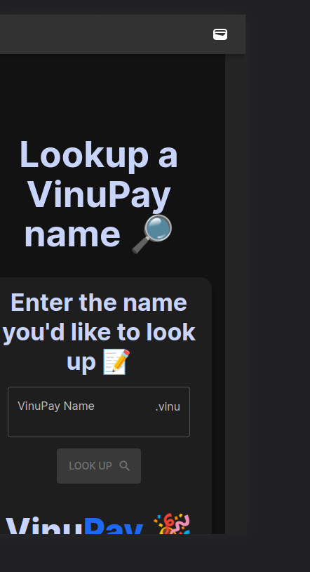
Box Element causing overflows on smaller screens, even though it does not reach the end of screen
I am using Material UI with React and Webpack
On smaller screens my react box component makes the screen "expand" on the right side, and this causes the navbar to expand, and also horizontal scroll to appear, I have attached my return code, and also a few screenshots that may help.
My element
Some screenshots of the issue:
https://i.stack.imgur.com/gtmJE.png
As you see on the "right side" of the view, the different grey colour appears, and that is the place where the element overflows.
You can view the issue here: https://dev.vinu.cash/nameLookup (visible on mobile devices, on chrome selecting Galaxy S8+ (360x740) device to view on also shows the issue.
On smaller screens my react box component makes the screen "expand" on the right side, and this causes the navbar to expand, and also horizontal scroll to appear, I have attached my return code, and also a few screenshots that may help.
My element
 return (
    <div>
        {/* Name "input" panel */}
        <Container>
            <Box
                sx={{
                    maxWidth: { xs: 350, sm: 480, md: 600, lg: 800},
                    borderWidth: 15,
                    borderStyle: 'solid',
                    borderColor: 'background.paper',
                    borderRadius: 4,
                    boxShadow: 8,
                    backgroundColor: 'background.paper',
                    '&:hover': {
                        backgroundColor: 'background.paper',
                        opacity: [0.98, 0.93, 0.9],
                    },
                }}
            >
                <Typography variant="h4" sx={{fontWeight: 700}}>Enter the name you'd like to look up 📝</Typography>

                <FormControl sx={{ m: 2, width: '26ch' }} variant="outlined">
                    <OutlinedInput id="filled-basic" type="text" label="VinuPay Name" variant="filled" sx={{paddingBottom: 2}}  error={!isValid} onChange={(event) => {checkNameValidity(event.target.value)}} endAdornment={<InputAdornment position="end">.vinu</InputAdornment>}/>
                    <InputLabel htmlFor="filled-adornment-amount">VinuPay Name</InputLabel>
                    <Typography variant="h6" display={reasonId === undefined ? "none" : "block"} color={isValid ? "#1eff18" : "#ff0000"}>{isValid ? "Looking good!" : reason}</Typography>
                </FormControl>
                <br/>
                <LoadingButton
                    onClick={() => {lookupName()}}
                    endIcon={<SearchRoundedIcon />}
                    loading={shouldLoad}
                    loadingPosition="end"
                    variant="contained"
                    color="secondary" sx={{minHeight: 50, minWidth: 120}}
                    disabled={!isValid || name === ''}
                >
                    Look up
                </LoadingButton>
                <Typography variant="h3" sx={{fontWeight: 800, paddingTop : 5}}>Vinu<Typography display="inline" variant="h3" sx={{fontWeight: 800, color: '#006aff'}}>Pay 🎉</Typography></Typography>
                <Typography variant="h5" sx={{fontWeight: 700, mt: 5}} color="error">NOTICE: The displaying of the result of the lookup will most likely be changed in future versions. Happy to hear your feedback :) </Typography>
            </Box>

        </Container>

        {/* Name "output" panel */}
        <Container sx={{paddingTop: 3}}>
            {nameData !== null? <NamePanel name={nameData.name} nameId={nameData.nameId} owner={nameData.ownerAddress} isVerified={name.isTrusted}  canManage={false} style={{paddingTop: 5}}/> : ''}
        </Container>
    </div>
)
return (
<div>
{/* Name "input" panel */}
<Container>
<Box
sx={{
maxWidth: { xs: 350, sm: 480, md: 600, lg: 800},
borderWidth: 15,
borderStyle: 'solid',
borderColor: 'background.paper',
borderRadius: 4,
boxShadow: 8,
backgroundColor: 'background.paper',
'&:hover': {
backgroundColor: 'background.paper',
opacity: [0.98, 0.93, 0.9],
},
}}
>
<Typography variant="h4" sx={{fontWeight: 700}}>Enter the name you'd like to look up 📝</Typography>
<FormControl sx={{ m: 2, width: '26ch' }} variant="outlined">
<OutlinedInput id="filled-basic" type="text" label="VinuPay Name" variant="filled" sx={{paddingBottom: 2}} error={!isValid} onChange={(event) => {checkNameValidity(event.target.value)}} endAdornment={<InputAdornment position="end">.vinu</InputAdornment>}/>
<InputLabel htmlFor="filled-adornment-amount">VinuPay Name</InputLabel>
<Typography variant="h6" display={reasonId === undefined ? "none" : "block"} color={isValid ? "#1eff18" : "#ff0000"}>{isValid ? "Looking good!" : reason}</Typography>
</FormControl>
<br/>
<LoadingButton
onClick={() => {lookupName()}}
endIcon={<SearchRoundedIcon />}
loading={shouldLoad}
loadingPosition="end"
variant="contained"
color="secondary" sx={{minHeight: 50, minWidth: 120}}
disabled={!isValid || name === ''}
>
Look up
</LoadingButton>
<Typography variant="h3" sx={{fontWeight: 800, paddingTop : 5}}>Vinu<Typography display="inline" variant="h3" sx={{fontWeight: 800, color: '#006aff'}}>Pay 🎉</Typography></Typography>
<Typography variant="h5" sx={{fontWeight: 700, mt: 5}} color="error">NOTICE: The displaying of the result of the lookup will most likely be changed in future versions. Happy to hear your feedback :) </Typography>
</Box>
</Container>
{/* Name "output" panel */}
<Container sx={{paddingTop: 3}}>
{nameData !== null? <NamePanel name={nameData.name} nameId={nameData.nameId} owner={nameData.ownerAddress} isVerified={name.isTrusted} canManage={false} style={{paddingTop: 5}}/> : ''}
</Container>
</div>
)Some screenshots of the issue:
https://i.stack.imgur.com/gtmJE.png
As you see on the "right side" of the view, the different grey colour appears, and that is the place where the element overflows.
You can view the issue here: https://dev.vinu.cash/nameLookup (visible on mobile devices, on chrome selecting Galaxy S8+ (360x740) device to view on also shows the issue.

